


Cafe Perks
I recently finished a new trifold menu for Cafe Perks, a mom & pop, breakfast/lunch-style restaurant with four locations in the Orlando area. The owner is a friend of mine. We met years ago when I worked for one of his companies as a graphic artist. It was in the flexographic industry. Flexo is a printing process which uses a flexible relief plate. The art and design work I did was for plastic bags, like you’d get from supermarkets, and coffee packages inside motel/hotel rooms. That sort of thing. Flexo is a lot different from the offset web and sheet fed printing designs I did for many years, even though both use four color process (CMYK) and Pantone inks. Today, companies can go to places like Staples to get jobs run off a B&W or color copier. That’s exactly the case with these menus, although I don’t know where they were copied. In this instance, after I burned PDF files of the pages to a CD, my job was finished.
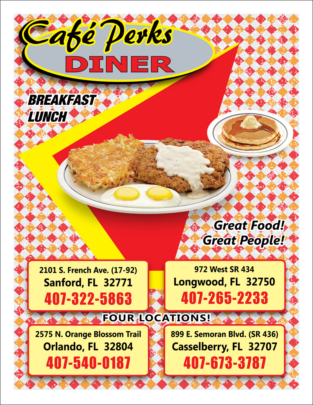
What the owner wanted was the look and feel of a good, old-fashioned American diner, and he wanted an image of a diner on the front cover page. Having grown up in New Jersey, probably the birthplace of this genre of restaurants, I knew a thing or two about them, especially at 2:00-2:30 in the morning, after local bars locked their doors. As a matter of fact, my hometown of Flemington had the Circle Diner, where I munched out on French fries with gravy on many-a-night, along with a few slices of the best cheesecake in the universe.
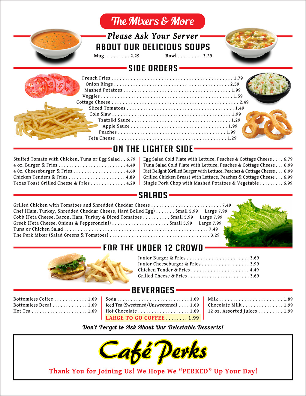
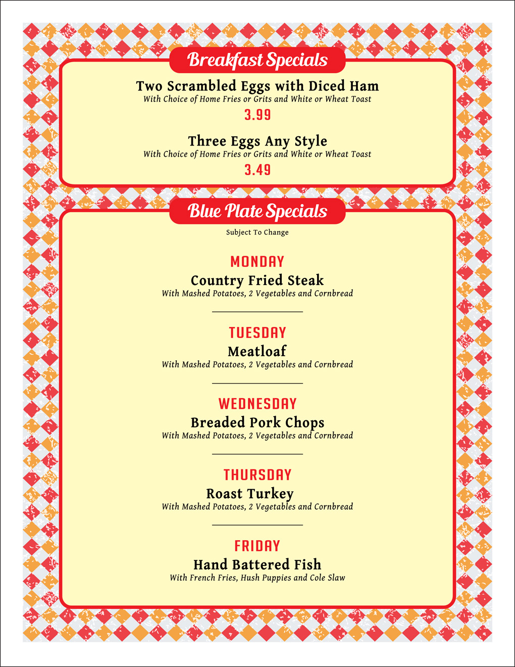
While I knew how to design the menu from many, many years of working in the field of graphics and typography, I just couldn’t find the right picture. There was nothing at all that I could appropriately incorporate, so the cover went on hiatus. Meanwhile, I had the rest of the menu to work on. The owner and I met many times to go over items, including additions, deletions and prices. This type of work is something I can really sink my teeth into because I spent so many years in the restaurant business. It’s in my blood, and there were four pages of food and a back cover that needed attention. The back was going to be daily specials. As far as the front cover was concerned, whenever I put something on the back burner, a design recipe always pops into my head out of nowhere, like rye toast in a New York minute. I wasn’t the least bit concerned.
Eventually, I convinced him that there was no reason to put a diner on the cover. Not only could I not find one, I didn’t think it was necessary or pertinent. I guess it harked back to my old diner days because I couldn’t get the feel of the real deal out of my head. Take Denny’s, for example. Many of them call themselves diners, but are they really? Do you feel like you’re walking into one? I didn’t think so, and it’s the same thing with Cafe Perks. However, there was no reason why I couldn’t make the menu look like you were sitting inside of one and, in this regard, I left the integrity of his wishes intact. He wanted food pictures and I gave him that, although there were so many food items, it couldn’t be as loaded with photos as I wanted without becoming too busy.
Here is what I ended up doing. If you live in (or visit) the Orlando area, please stop by Cafe Perks. Believe me, the food is really good — exactly what you’d expect from a diner, but without the diner prices.
(Someone else sold and designed the ads, which paid for printing the menus.)
 Dave Knechel | tagged Dave Knechel, Marinade Dave | Share Article
  LEGAL NOTICE
©David B. Knechel. All Rights Reserved. No portion of this site can be reproduced in it's entirety or in part without expressed written permission by the owner/administrator of this site in accordance with the Digital Millennium Copyright Act. Section 512(c)(3) of the U.S. Copyright Act, 17 U.S.C. §512(c)(3). The charges against defendants are mere accusations and the subjects are presumed innocent until found guilty in a court of law.
LEGAL NOTICE
©David B. Knechel. All Rights Reserved. No portion of this site can be reproduced in it's entirety or in part without expressed written permission by the owner/administrator of this site in accordance with the Digital Millennium Copyright Act. Section 512(c)(3) of the U.S. Copyright Act, 17 U.S.C. §512(c)(3). The charges against defendants are mere accusations and the subjects are presumed innocent until found guilty in a court of law.
